Part 2 of 4: Trading Charts
Introduction
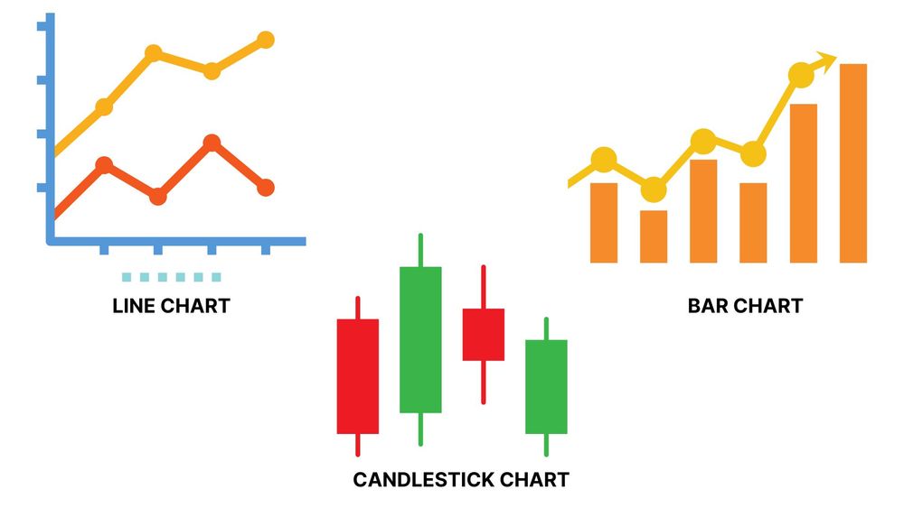
Here are the three varieties of charts:
- Line charts: Line charts are the simplest visual representation of asset prices. The chart has points for the price at each time interval with a line connecting each point. A related "mountain" chart shades the area under the connected dots to make the price movements easier to see. (Few TA practitioners use Line Charts because they give very little information)
- Bar charts: A bar chart (a.k.a HLOC chart) has vertical bars. HLOC stands for high, low, open, and close. Each bar covers one unit of time. The top of the bar is the high for the unit, and the bottom is the low. Each bar also has a notch on the left and another one on the right. The one on the left side of the bar is the opening price for the time period, while the one on the right is the closing.
- Candlestick charts. Candlesticks also show high, low, open, and close price information. Because they rely on thicker bars and colors, most traders prefer candlestick charts because they are easier to visualize and deliver far more readily visible information on market trends.
Which of these options provides the best crypto technical analysis tools?
The Best Charts for TA
An Overview of Candlestick Charts
Here is how candlesticks give you prices high, low, open, and close with a single candle. Candlesticks are thin vertical rectangles that look like traditional candles. Trading chart candles can have two wicks: One at the top, and one at the bottom. Though they look like wicks (thin vertical lines coming out of the candle), TA traders refer to them as “shadows.”
One final feature of candlesticks is their color. The body of the candlestick is usually green (or light) if the market closes higher for the time period the candle represents. And it is red (or dark) if the market closes down for that period. (Most charting software will allow you to customize your colors, but green and red are typically the defaults.)
If–during the period of time represented by the candle–the price is higher than it started, the candle is green. If however, the price is lower than the time period represented by the candle–e.g. 1 hour, 1 day, 1 minute, etc–then the candle is red.
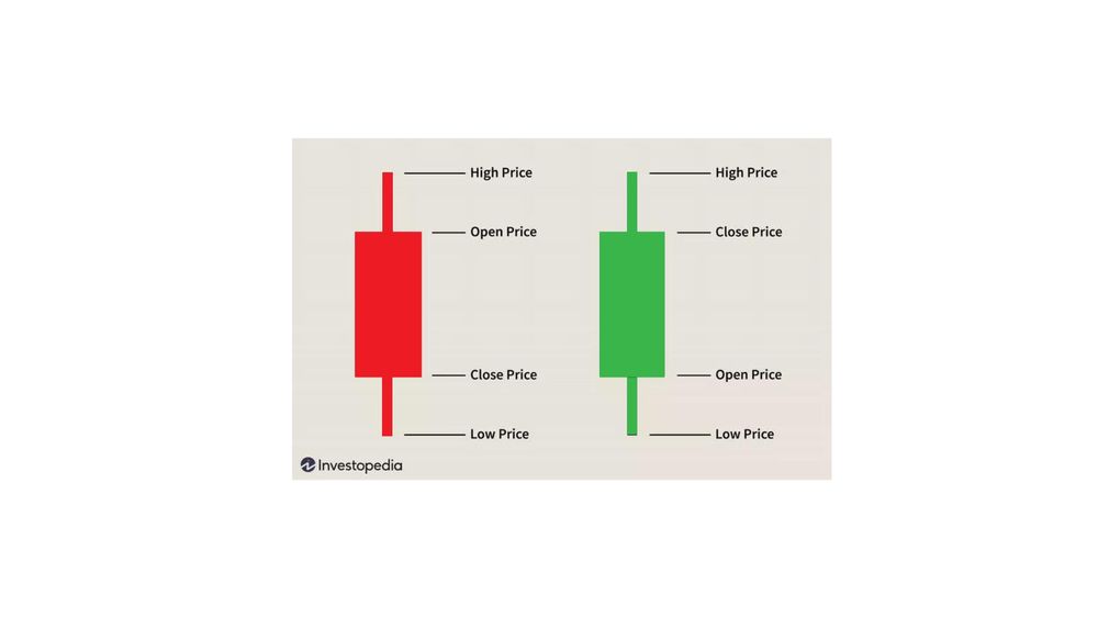
So here is the information you will see in a candle
- The ‘open’ is the lowest end of a green candle and the highest part of a red one.
- The close is the top end of a light candle or the low end of a dark one.
- The high is the shadow coming out of the top of the candle.
- The low is the shadow pointing down from the body’s bottom.
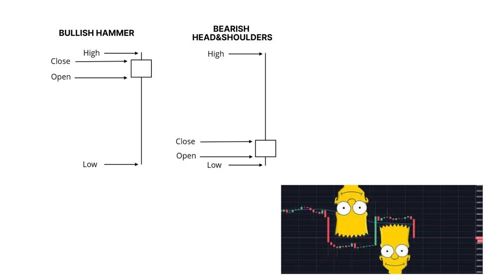
Some candles are short with small or invisible shadows, signifying that there was not much market movement during the period. Others have long bodies, meaning the market moved significantly. Long shadows sometimes predict market reversals and increased volatility. So how do traders use candlesticks?
They look for patterns of one or more candles to gain insight into market conditions. For example, a long downward-closing red candle without shadows, followed by a short candle with short shadows that opens and closes lower than the previous candle could potentially signal a price reversal, and will often be considered bearish (i.e. the price is likely to continue going down). But the next, third candle could either confirm this hypothesis–if for example a new price low is achieved, or counter it if, for example, the next candle is a ‘bullish engulfing candle’ (i.e. it starts lower than the last, and ends higher than the first, large red candle).
There are dozens of candlestick patterns. Some–like the hammer, a bullish (rising market signal) candle with a short upward-closing body and a very long downside shadow–are one-figure patterns. Meanwhile, the bearish (downward price movement) head and shoulders pattern, which consists of a high price wave surrounded by two lower price waves, can have 20 or more candles (it can also resemble the head of Bart Simpson, and is often referred to as such!) To see these concepts illustrated live, we encourage you to do a quick search on YouTube and have a pro explain it to you in real-time (e.g. search “TA using Candlestick charts”).
CFI & SmartOptions